
In this article, we will explore how to develop a versatile JavaScript code that allows you to transform any HTML element into an accessible side panel accompanied by a button trigger.
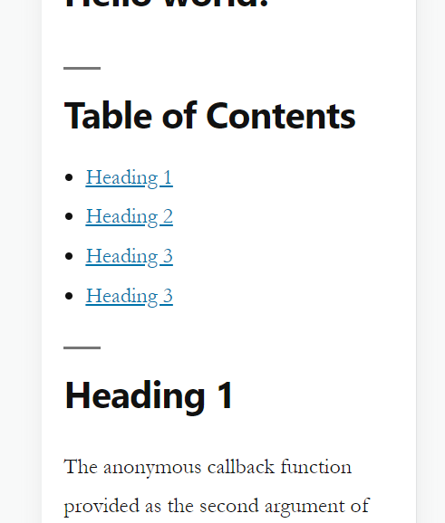
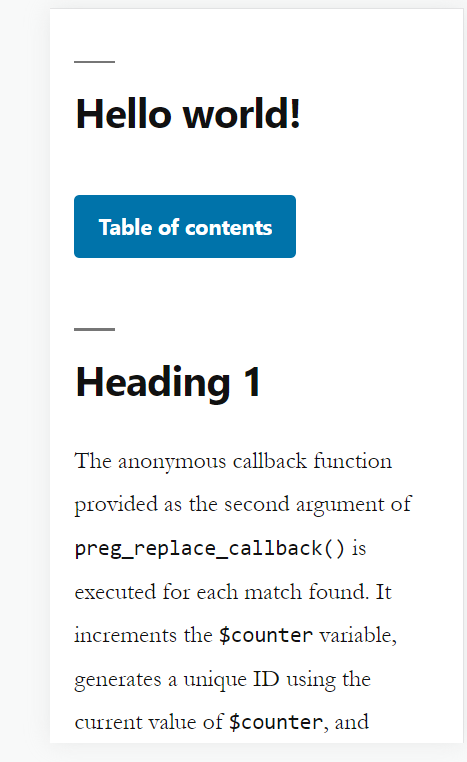
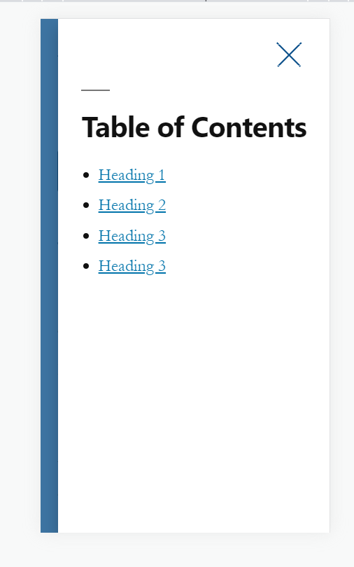
For instance, imagine you have a lengthy table of contents that could benefit from being concealed behind a button. With our JavaScript solution, you can effortlessly implement a side panel that reveals the table of contents upon activation, providing a seamless user experience.”
Enqueue required scripts and styles
To enqueue the JavaScript and CSS files for the side panel functionality, assuming the file names are sidepanel.js for the JavaScript file and sidepanel.css for the CSS file, you can use the following code in your WordPress theme’s functions.php file:
function enqueue_sidepanel_scripts_and_styles() {
    // Enqueue JS file
    wp_enqueue_script( 'sidepanel-script', get_template_directory_uri() . '/js/sidepanel.js', array( 'jquery' ), '1.0', true );

    // Enqueue CSS file
    wp_enqueue_style( 'sidepanel-style', get_template_directory_uri() . '/css/sidepanel.css', array(), '1.0', 'all' );
}
add_action( 'wp_enqueue_scripts', 'enqueue_sidepanel_scripts_and_styles' );
Now in sidepanel.css file add the following.
@media (max-width: 768px) {
  [data-collapse] {
        margin: 0 !important;
        display: none;
        position: fixed;
        min-width: 60%;
        top: 0;
        right: 0;
        z-index: 1000;
        overflow: auto;
        background-color: #fff;
        padding: 70px 30px;
        height: 100%;
        box-shadow: 0px 10px 20px rgba(0, 0, 0, 0.25);
    }
  [data-collapse].active {
        display: block;
    }
  [data-collapse] .btn-close {
        position: fixed;
        top: 30px;
        right: 30px;
        width: 16px;
        height: 16px;
        background-color: transparent;
        border: none;
        background-image: url("data:image/svg+xml,%3Csvg width='18' height='17' viewBox='0 0 18 17' fill='none' xmlns='http://www.w3.org/2000/svg'%3E%3Cpath d='M15.9991 15.6085L1.18978 0.799173' stroke='%230D518B' stroke-linecap='square'/%3E%3Cpath d='M1.78234 15.6085L16.5916 0.799154' stroke='%230D518B' stroke-linecap='square'/%3E%3C/svg%3E%0A");
        background-size: contain;
        background-repeat: no-repeat;
        background-position: center;
        z-index: 1000;
    }
    body.side-panel-active {
      overflow: hidden;
    }
    body.side-panel-active:before {
        content: "";
        position: fixed;
        top: 0;
        left: 0;
        width: 100%;
        height: 100%;
        background: rgba(13, 81, 139, 0.8);
        z-index: 1000;
    }
  }
Please note you can use any breakpoint you want instead of 768px in the code above.
in your sidepanel.js add the following
if ( $(window).width() <= 768 ) {
    // any element with data-collapse.
    $('[data-collapse]').each(function(){
        let sidePanel = $(this);
        let buttonText = $(this).data('collapse');
        // generate a unique id for the panel
        let panelID = 'side-panel-'+Math.floor(Math.random() * 1000000);
        let button = $('<button class="btn-collapse" aria-label="Open side panel" aria-controls="'+panelID+'">'+buttonText+'</button>');
        let close = $('<button class="btn-close" aria-label="Close side panel"></button>');
        sidePanel.after(button);
        sidePanel.prepend(close);
        // add aria attributes
        sidePanel.attr('id', panelID);
        sidePanel.attr('aria-hidden', 'true');
        button.attr('aria-expanded', 'false');
        button.click(function(){
            sidePanel.toggleClass('active');
            $('body').toggleClass('side-panel-active');
            // toggle aria attributes
            if ( sidePanel.hasClass('active') ) {
                sidePanel.attr('aria-hidden', 'false');
                button.attr('aria-expanded', 'true');
                let tabbable = sidePanel.find('[tabindex]:not([tabindex="-1"]), a[href]:not([disabled]), button:not([disabled]), textarea:not([disabled]), input[type="text"]:not([disabled]), input[type="radio"]:not([disabled]), input[type="checkbox"]:not([disabled]), select:not([disabled])');
                let firstTabbable = tabbable.first();
                let lastTabbable = tabbable.last();
                firstTabbable.focus();
                lastTabbable.keydown(function(e){
                    if ( e.keyCode === 9 && !e.shiftKey ) {
                        e.preventDefault();
                        firstTabbable.focus();
                    }
                });
            } else {
                sidePanel.attr('aria-hidden', 'true');
                button.attr('aria-expanded', 'false');
            }

        });
        // enter key
        button.keyup(function(e){
            if ( e.keyCode === 13 ) {
                sidePanel.toggleClass('active');
                $('body').toggleClass('side-panel-active');
                // toggle aria attributes
                if ( sidePanel.hasClass('active') ) {
                    sidePanel.attr('aria-hidden', 'false');
                    button.attr('aria-expanded', 'true');
                    let tabbable = sidePanel.find('[tabindex]:not([tabindex="-1"]), a[href]:not([disabled]), button:not([disabled]), textarea:not([disabled]), input[type="text"]:not([disabled]), input[type="radio"]:not([disabled]), input[type="checkbox"]:not([disabled]), select:not([disabled])');
                    let firstTabbable = tabbable.first();
                    let lastTabbable = tabbable.last();
                    firstTabbable.focus();
                    lastTabbable.keydown(function(e){
                        if ( e.keyCode === 9 && !e.shiftKey ) {
                            e.preventDefault();
                            firstTabbable.focus();
                        }
                    });
                } else {
                    sidePanel.attr('aria-hidden', 'true');
                    button.attr('aria-expanded', 'false');
                }
            }
        });
        close.click(function(){
            sidePanel.removeClass('active');
            $('body').removeClass('side-panel-active');
            // toggle aria attributes
            sidePanel.attr('aria-hidden', 'true');
            button.attr('aria-expanded', 'false');
            // move focus to the button
            button.focus();
        });
        // escape key
        $(document).keyup(function(e){
            if ( e.keyCode === 27 ) {
                // toggle aria attributes
                sidePanel.attr('aria-hidden', 'true');
                button.attr('aria-expanded', 'false');
                sidePanel.removeClass('active');
                $('body').removeClass('side-panel-active');
                // move focus to the button
                button.focus();
            }
        });
        // click outside
        $(document).mouseup(function(e){
            // if only sidepanel is active
            if ( !sidePanel.is(e.target) && sidePanel.hasClass('active') && sidePanel.has(e.target).length === 0 ) {
                // toggle aria attributes
                sidePanel.attr('aria-hidden', 'true');
                button.attr('aria-expanded', 'false');
                sidePanel.removeClass('active');
                $('body').removeClass('side-panel-active');
                button.focus();
            }
        });

    });
}
The code you provided is a JavaScript snippet that adds functionality to convert any HTML element into an accessible side panel with a button trigger. Here’s an explanation of the code:
- It checks if the window width is less than or equal to 768 pixels. This is typically used to target mobile or smaller screens, you can change this value as desired.
- The
each()function iterates over each element with thedata-collapseattribute. - Inside the iteration, the code performs the following steps:
- Creates a unique ID for the side panel using
Math.random(). - Creates a button element with the class
btn-collapseand sets the appropriate aria-label and aria-controls attributes. - Creates a close button element with the class
btn-close. - Inserts the button before the side panel element and the close button inside the side panel element.
- Sets the ID and aria-hidden attributes on the side panel element.
- Sets the aria-expanded attribute on the button element.
- Adds a click event listener to the button that toggles the
activeclass on the side panel and theside-panel-activeclass on the body element. It also updates the aria attributes accordingly. - Adds a keyup event listener to the button for the Enter key, which performs the same toggle action as the click event.
- Adds a click event listener to the close button that removes the
activeclass from the side panel, removes theside-panel-activeclass from the body, updates the aria attributes, and focuses the button. - Adds a keyup event listener to the document for the Escape key, which performs the same actions as the close button click event.
- Adds a click event listener to the document that checks if a click occurred outside the side panel while it is active. If true, it performs the same actions as the close button click event.
- Creates a unique ID for the side panel using
- The code provides a way to create a collapsible side panel functionality with accessibility features such as ARIA attributes and keyboard interaction.